I’m going to show more than tell this week…
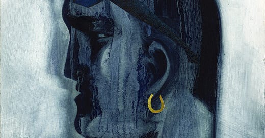
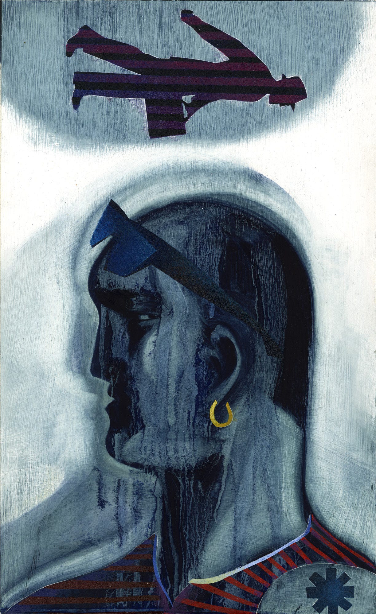
I was not trained as an Illustrator, so my ideas came from the process of the making of the image, rather than conceptualizing an approach to follow. In Rebel above, the portrait just kept being obliterated until I finally decided to let the silhouette and the burning solvent solve the face. The graphic businessman by day and the rebel by night is answered through the material handling, the direction, the colour pattern and scale of the subjects.
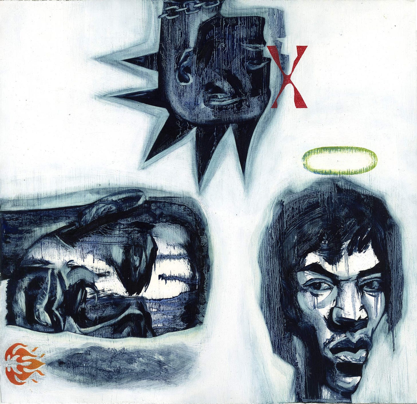
The 1990’s were a great time to do portraiture of musicians, I did this piece for the Alternative Pick sourcebook to promote my work in music mags and record companies. Is Illustration a reflection of the times, a visual mirror or a window into where culture is going?
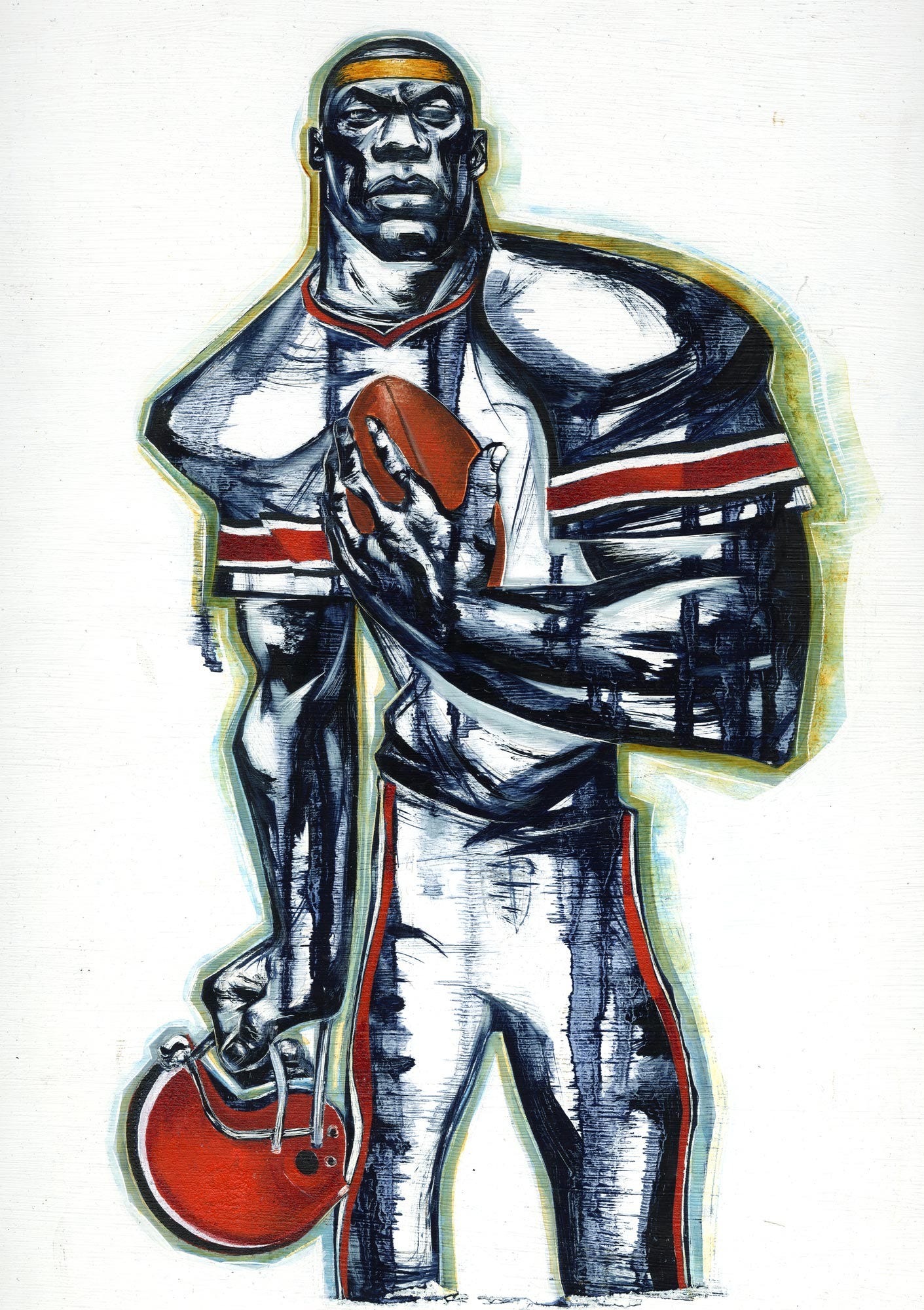
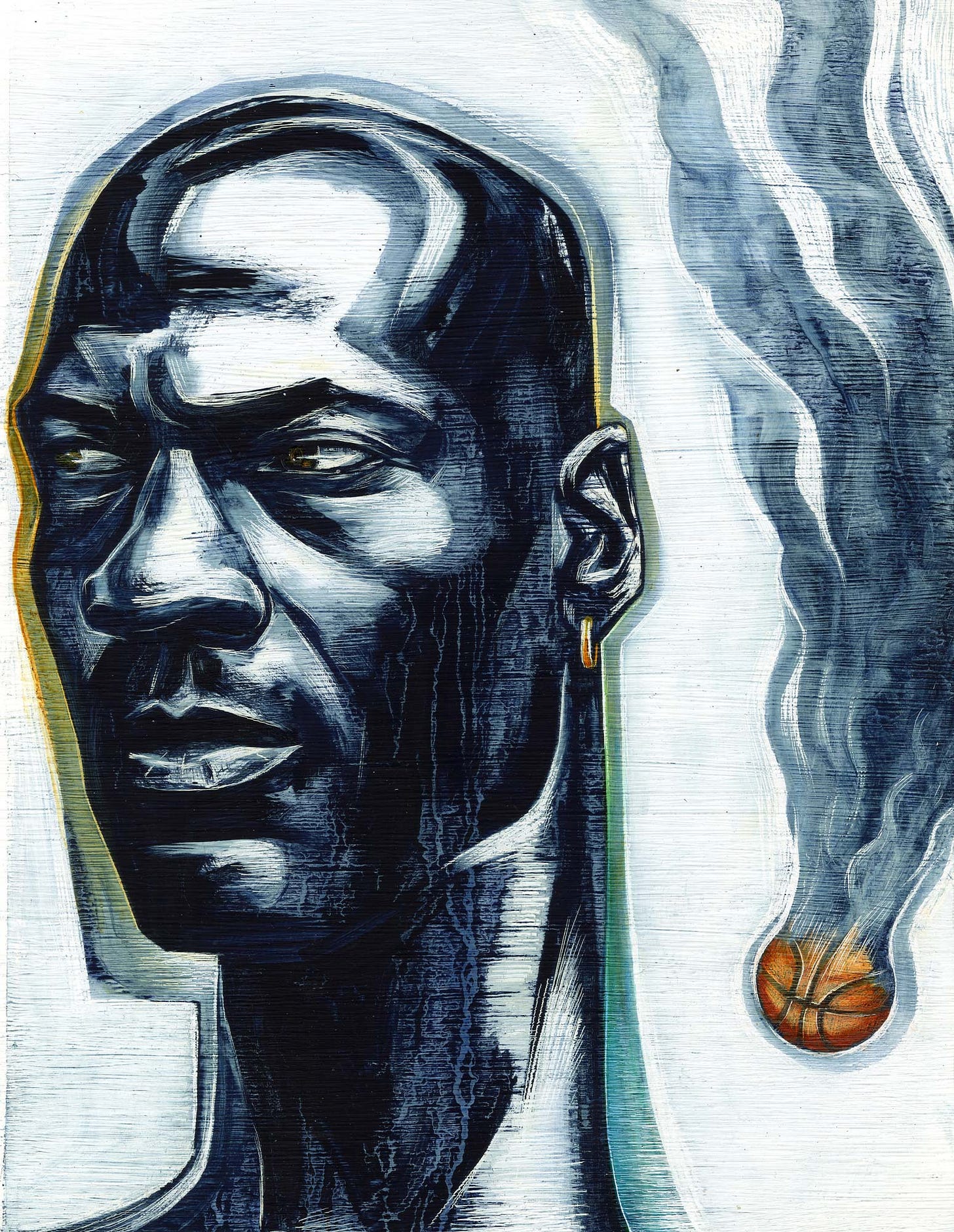
The late 1990’s were all about sports for me as I worked on NBA, NFL, MLB, NHL, soccer, golf, weightlifting, speed skating and tennis commissions. The graphic stencils of acrylic paint and the distortion and rawness of the oil paint combined to express the visual power of the different sports.
The 1990’s were defined by a growing worldwide celebrity culture. Michael Jordan was a great subject especially after he retired from basketball to play baseball in 1994 and then returned to play basketball in 1996 and won 3 consecutive championships. My approach is becoming more refined and conscious of capturing the likeness of the portrait.
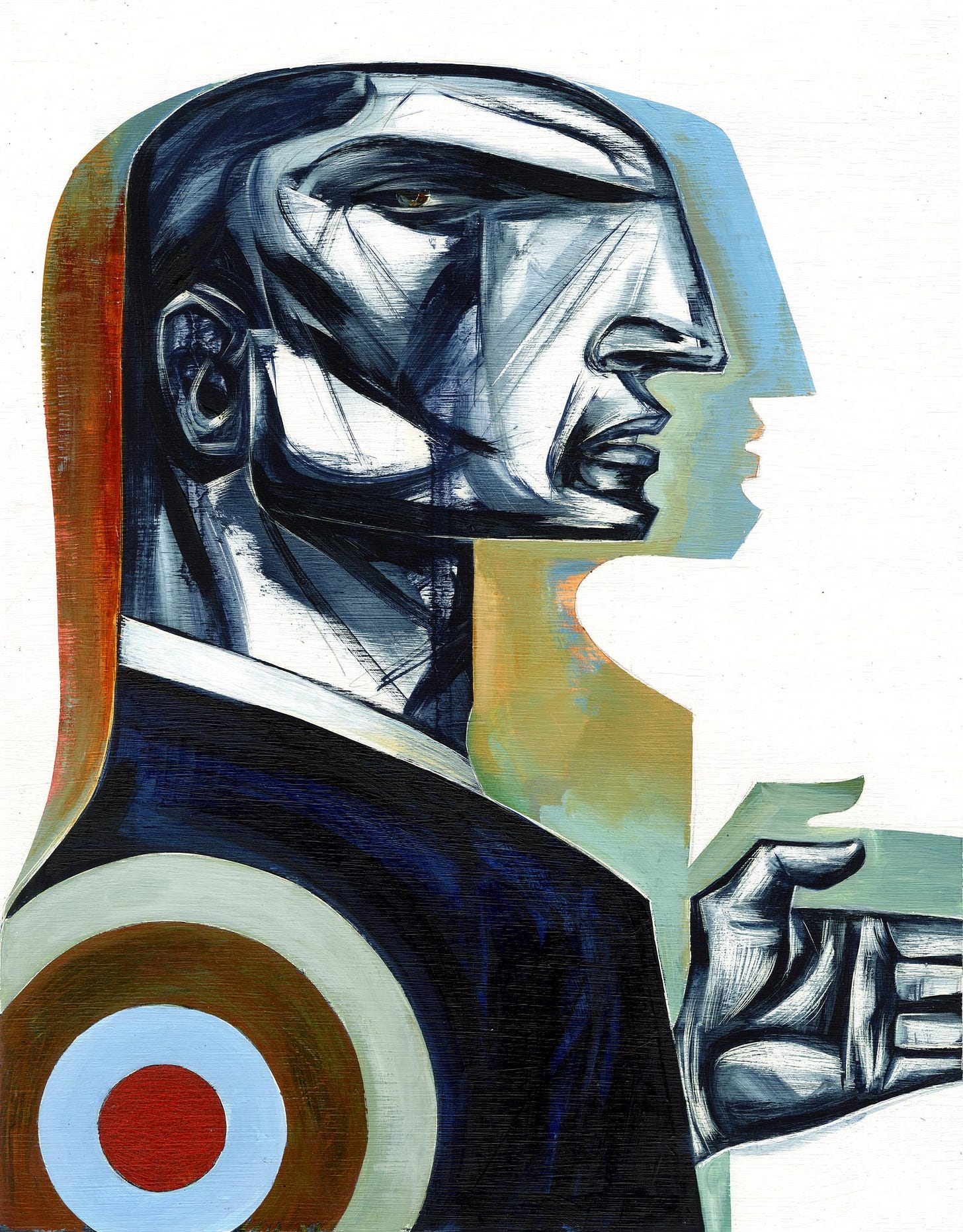
After 9/11, many of my assignments reflected concerns with security, safety and the fraught nature of the world. The painful crop of the outreaching hand —creating tension through the composition and the use of the edge became more prevalent in the early 2000’s. The character and the colour seem more abstracted and graphic and the less expressive edge and distortion seem to be looking for a solid shape to hang onto.
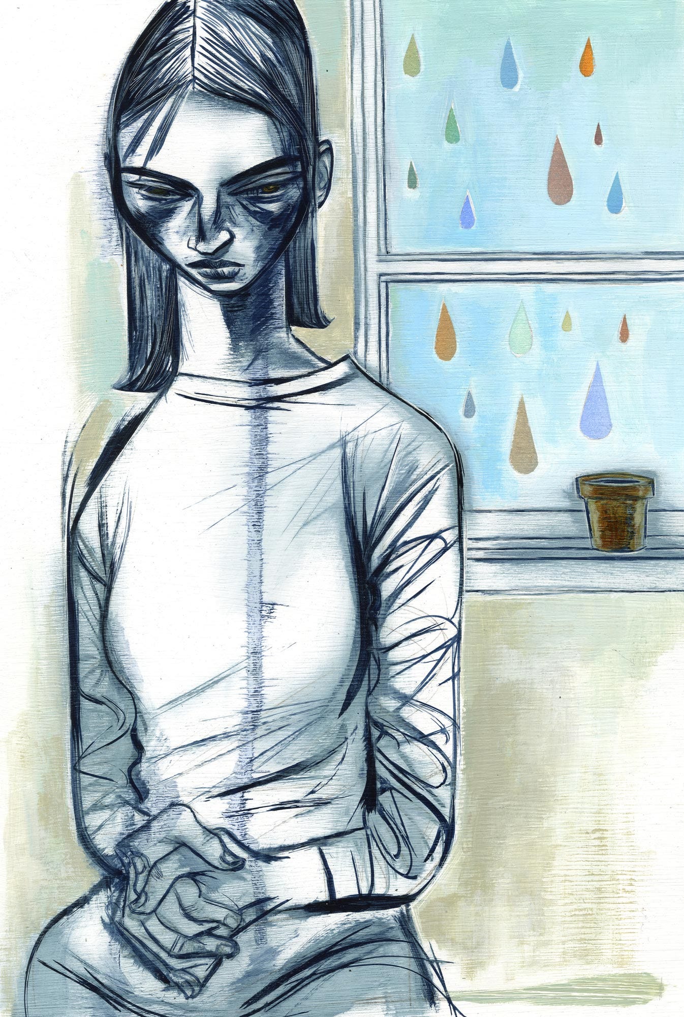
The 2000’s progressed and much of my work seemed to address sadness, anxiety, and our relationship or lack of relationship to our world. This piece relies on multiple dimensional brush lines and a flat distorted shape with much more of the background of the image utilized. The drawn lines of the form and the space and atmosphere of the background are purposely at odds. The tension is between the material and the handling of the separate oil and acrylic.
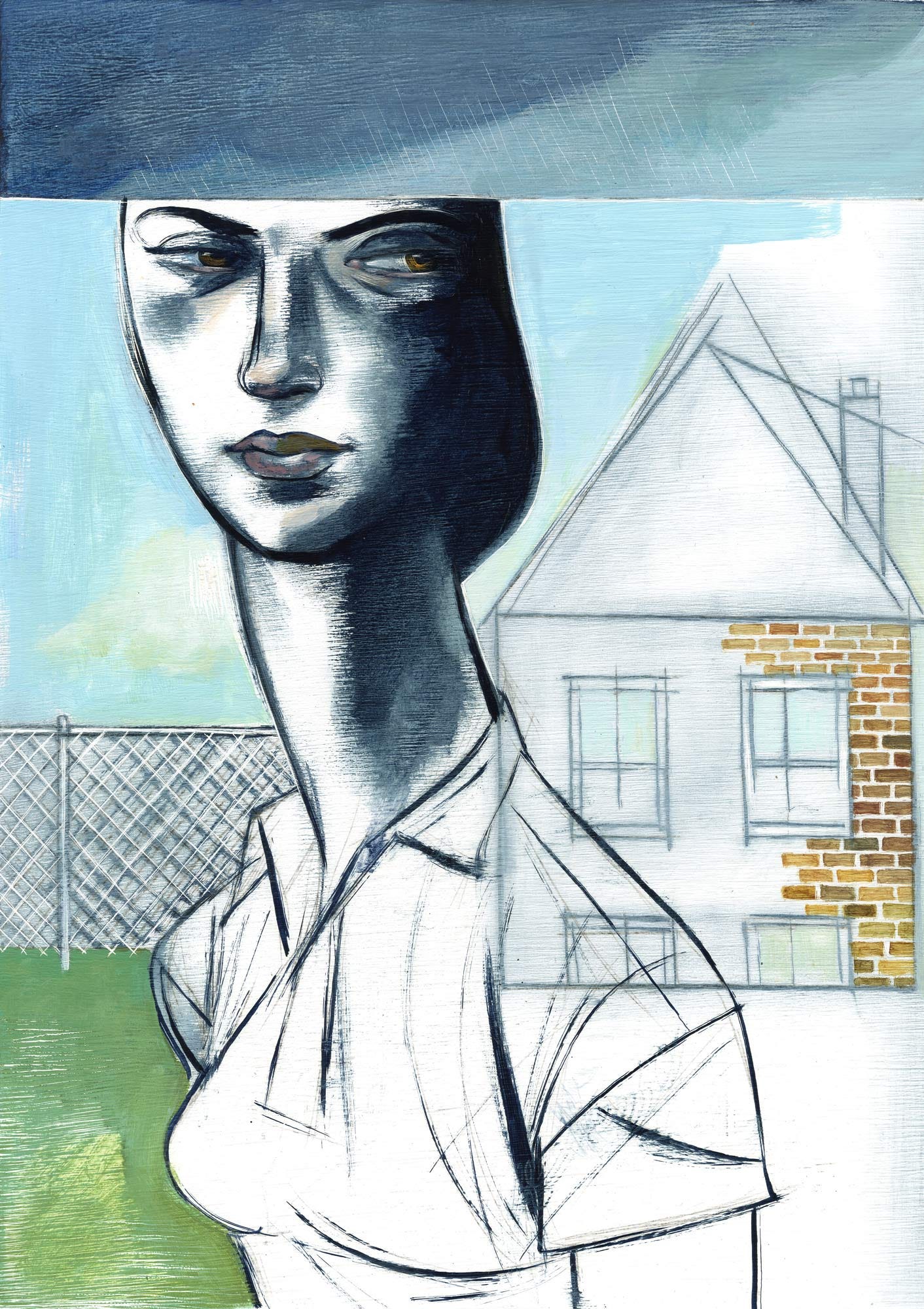
I stopped using oil paint as an Illustration medium and it was as much about health (stopping the use of solvents) as it was about a changing approach to expressing content. In this piece, one of my last oil paint images the line and the painted spaces are meant to express the uncertainty of a darkening forecast for first time home buyers.
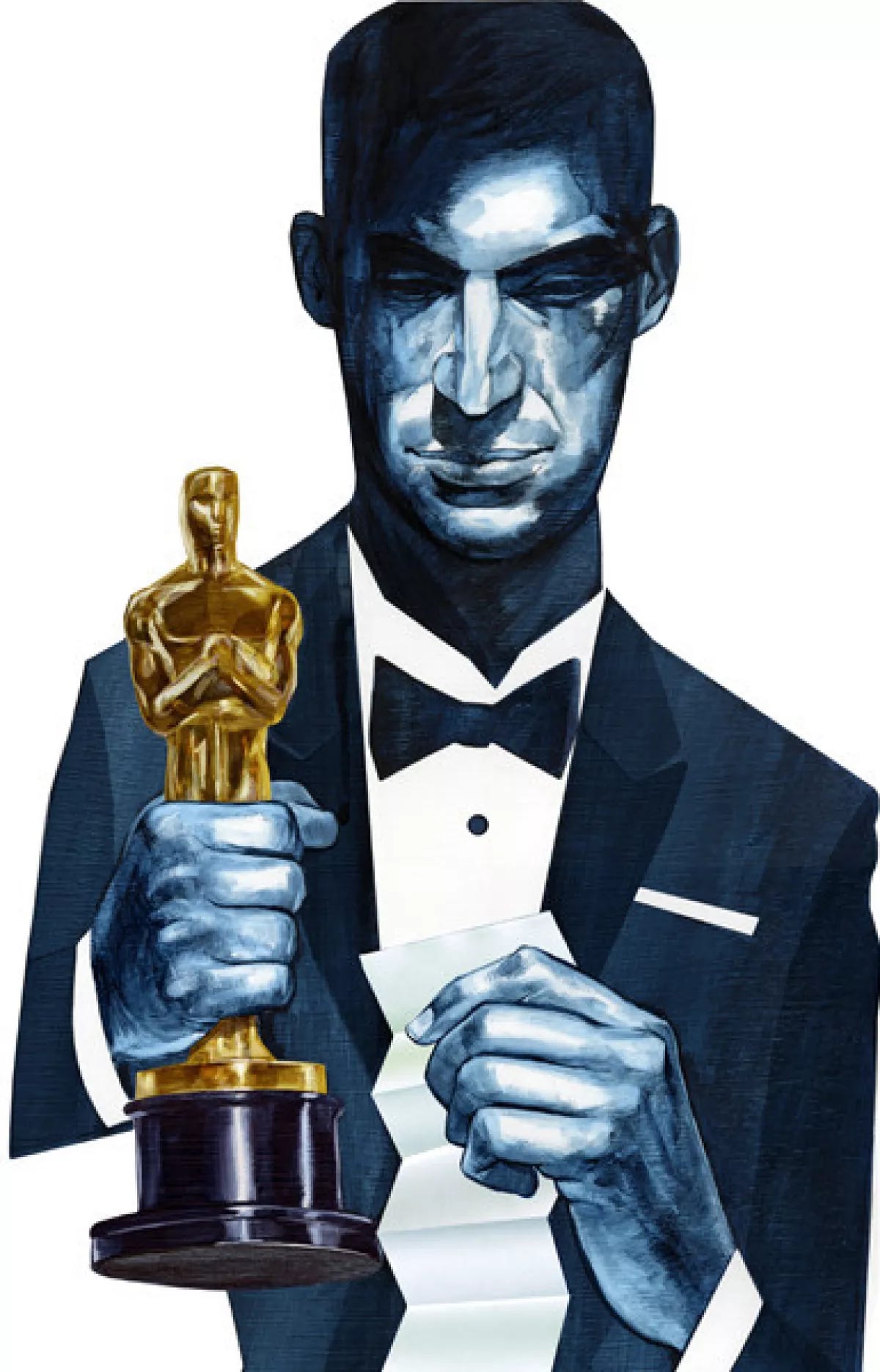
This is my first watercolour commission after I stopped painting in oil. I fell in love with the large darks and the painterly halftones I could achieve with the watercolour. No more gas mask!
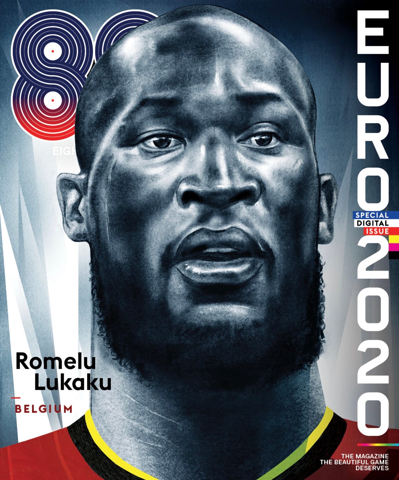
There is a thread that connects my illustrations from the first time I swiped oil paint across gessoed paper to the pixels that make up this completely digital portrait. A dialogue between, subject, material and the reading of the image. Illustration is a noun, an adjective, and a verb—-and that inherent fluidity is the power of a practice that can both mirror and provide a window on the culture we live in.



Interesting journey of materials. Water colour is gouache or what do you use exactly