


The Green Lawn and White Picket Fence
The Portfolio and Finding Your Voice

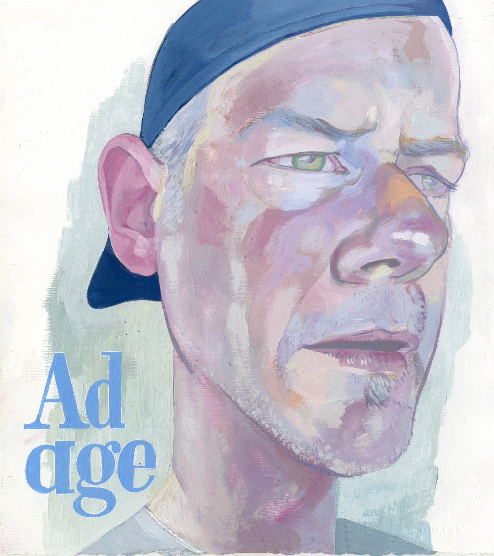
What is the function of an Illustration portfolio? A welcome mat for offering visual images that are personal and unique? We construct a style, but we also build a voice. The style of the work is the white picket fence we erect around our front yard. But as my good friend Erik Kessels has explored in workshops, it’s the mess in your backyard where new ideas are hidden and your voice is discovered. We create a storefront for our practice but what’s behind the facade? Creative work needs to be inspired by an approach that draws outside the lines, scratches beneath the surface. The Portfolio is more than the sum of its visual parts. How to go about creating or sourcing our voice is the real challenge. Exploring a new approach or a new medium can refresh the paint on the fence, but it needs to do more than just offer a slick coat of newness. The painting above was part of a few experiments I tried with a new material a friend suggested, acrylic gouache. I absolutely fell in love with the chalky surface of the pigment.
The acrylic gouache experiments were posted on my Instagram and led to an illustration in Adobe Fresco. I was travelling when I received the commission and I had the use of the iPad but didn’t have access to paint. This was the first and last Illustration I did in Fresco. I was caught in the teeth of technique and seeing no deeper than the pixel paint surface. The digital oil paint competently faceted the planes of the face, but I hadn’t found a reason for it to do that. This was not a digital material issue, this was an issue with decorating instead of communicating.
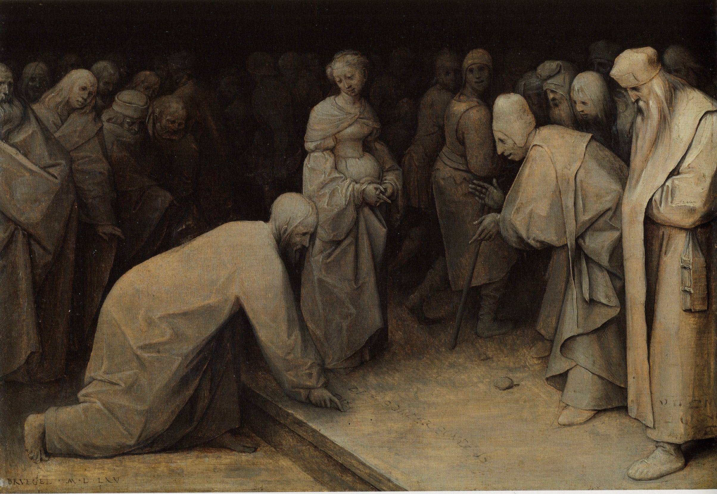
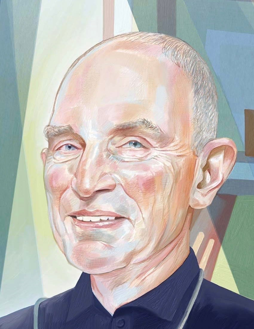
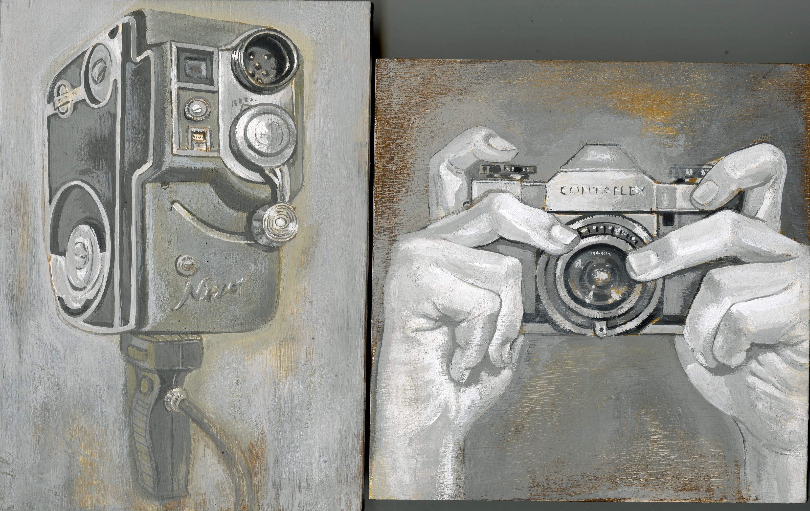
I returned to acrylic gouache painting again, but this time I had a plan. The Bruegel grisaille above, a method of monochromatic painting with a warm ground overlayed by grey tones, was an image in the Thames & Hudson book, Bruegel /The Master. I haven’t seen the original painting in the Courtald Gallery in London, but thank goodness for this reproduction because the other versions online lack the grey pallor and lose the impact of this enthralling image. The space and the atmosphere of this painting are incredible.


I was on sabbatical and reading, writing, and thinking about the role of images in communicating messages. I thought back to my first monochromatic indigo paintings in the 1990’s and their exploration of film and music culture. The method of grisaille painting was much more paint focused and atmospheric than my earlier graphic work. This lent itself to the more 3D nature of the subject matter of the nearly 80 small panel paintings I worked on. My intention was to create a large collection of painted ‘nouns’ that could be placed beside each other. I wanted to focus on how visual images are read and how ideas get lost in visual translation.
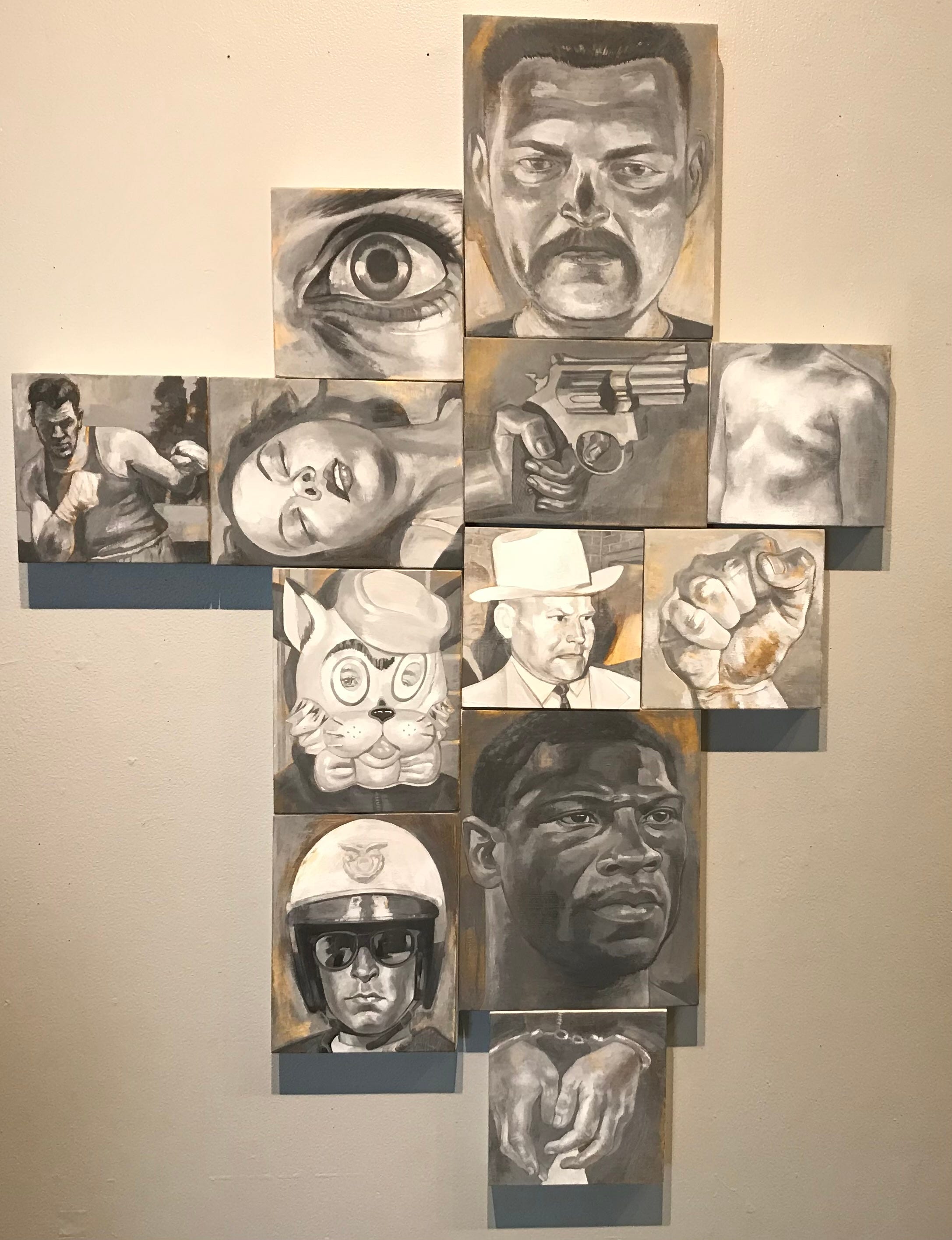
The arrangement of the paintings and their adjacent context would lead to a narrative—-the nouns would transform into a verb. Meaning would be assigned by each viewer despite the random nature of the juxtapositions. I could continue to reposition the images and more visual equations would ensue.
One of my studio walls is still devoted to a gathering of these images that continue to offer new readings. I painted these for my own engagement with the visual language of image, object, content, and context. They inform ideas that are central to my Portfolio but remain outside of it.

As an illustrator there is one other player in the development of your work…the client. This is where we especially get caught up in our front yard —-our hopeful face turned to the client. My original indigo painting portfolio was seen by a number of art director’s but the work wasn’t being commissioned. I asked some of the AD’s—-the images needed colour. How do I add colour without losing the graphic power of the indigo on white? This wasn’t just a visual tic to add to the image, it needed to be another layer of content. First, I tried oil paint —fail—too visually demanding. I needed to find a way to work with colour that supported the content of the image.

This was my very first use of a stencil, utilizing acrylic paint. I had found an answer.
The use of the acrylic paint and colour changed as my work changed, but I was always aware of not losing myself in the look of the image, but finding my message in the content of the image.
Develop your portfolio, leave the front yard alone for once—and make sure you get lost in the tangle of ideas in your back yard, this is the fertile ground that your work will grow from.