


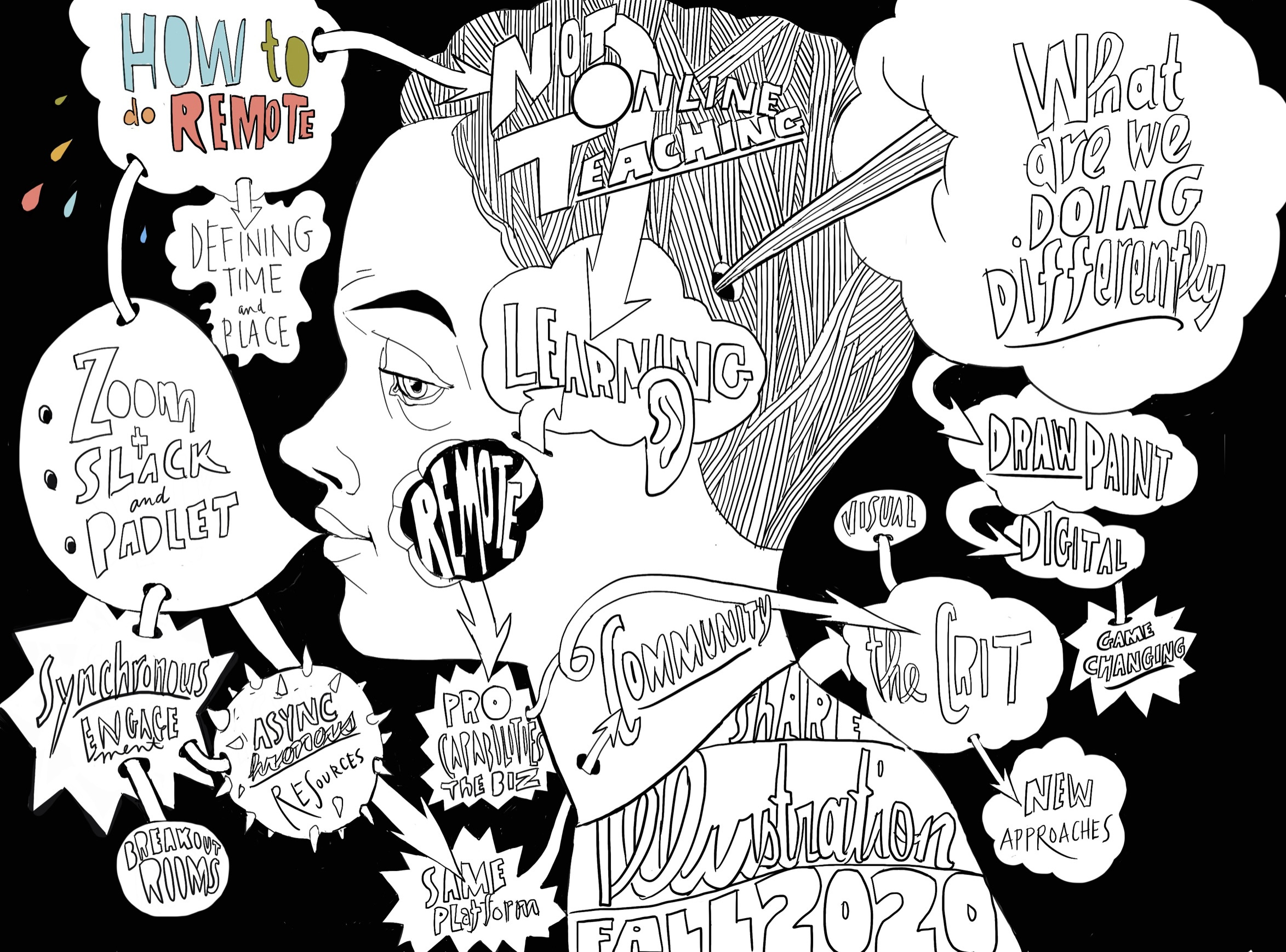
I have been thinking a lot about maps in the last 2 weeks. I am teaching an exercise in drawing, focused on direction and navigating form. The map is a visualization device for navigating complexity. The difficulty my students are having with this exercise may be linked to how we read visual information today or better yet, how we don’t read visual information.
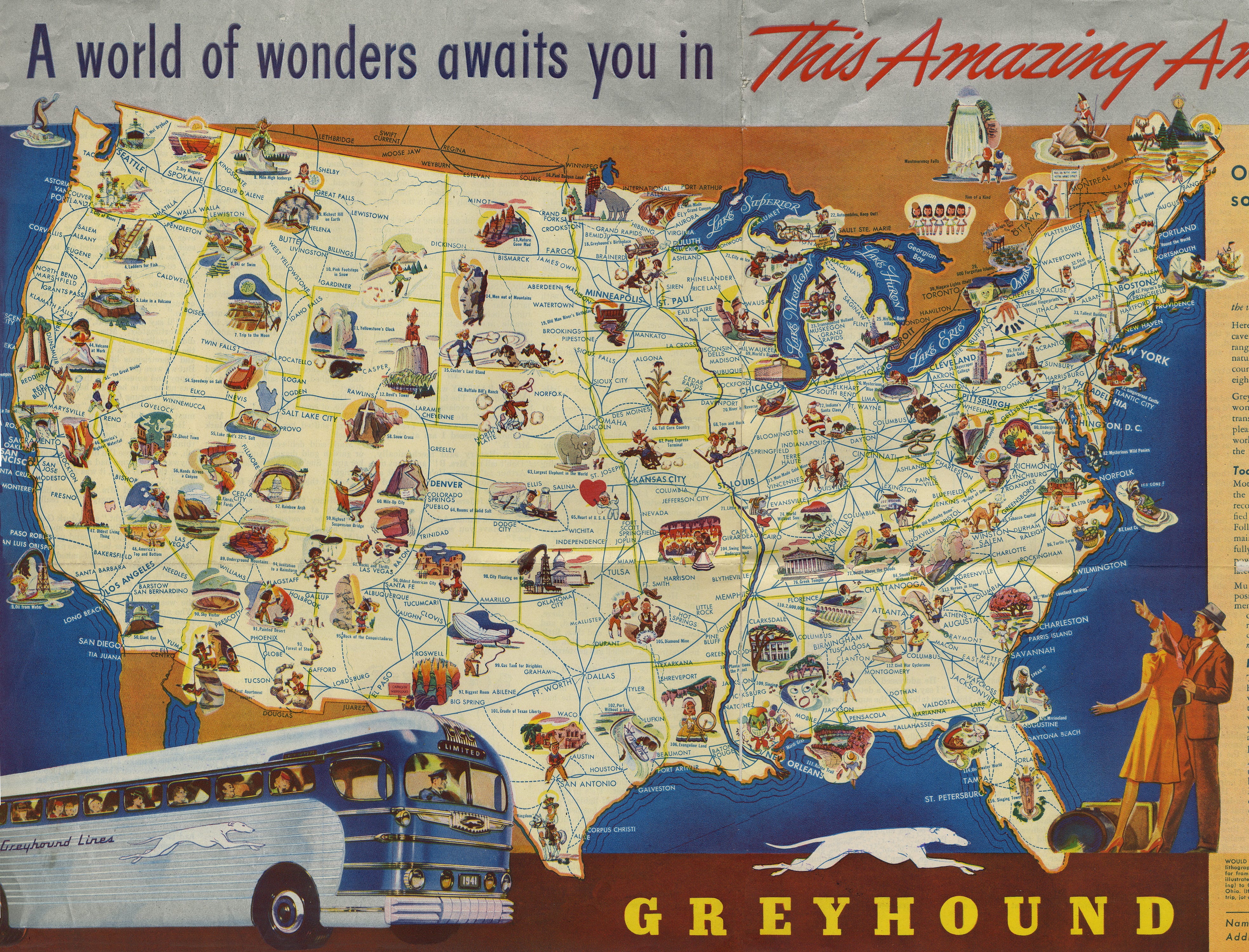
The world of flatland contained within a map is a wonder of economy and translation. Maps don’t just provide the variety of choices for moving from point A to point B. The essential purpose of the map dictates its form and complexity. This 1941 Greyhound ad is both a map of bus routes and an attempt to compete with the wonders of the world, the copy reads,“Here are colossal trees, old as the pyramids…” When world travel is curtailed by the War, no worries, the world of America is available by bus.
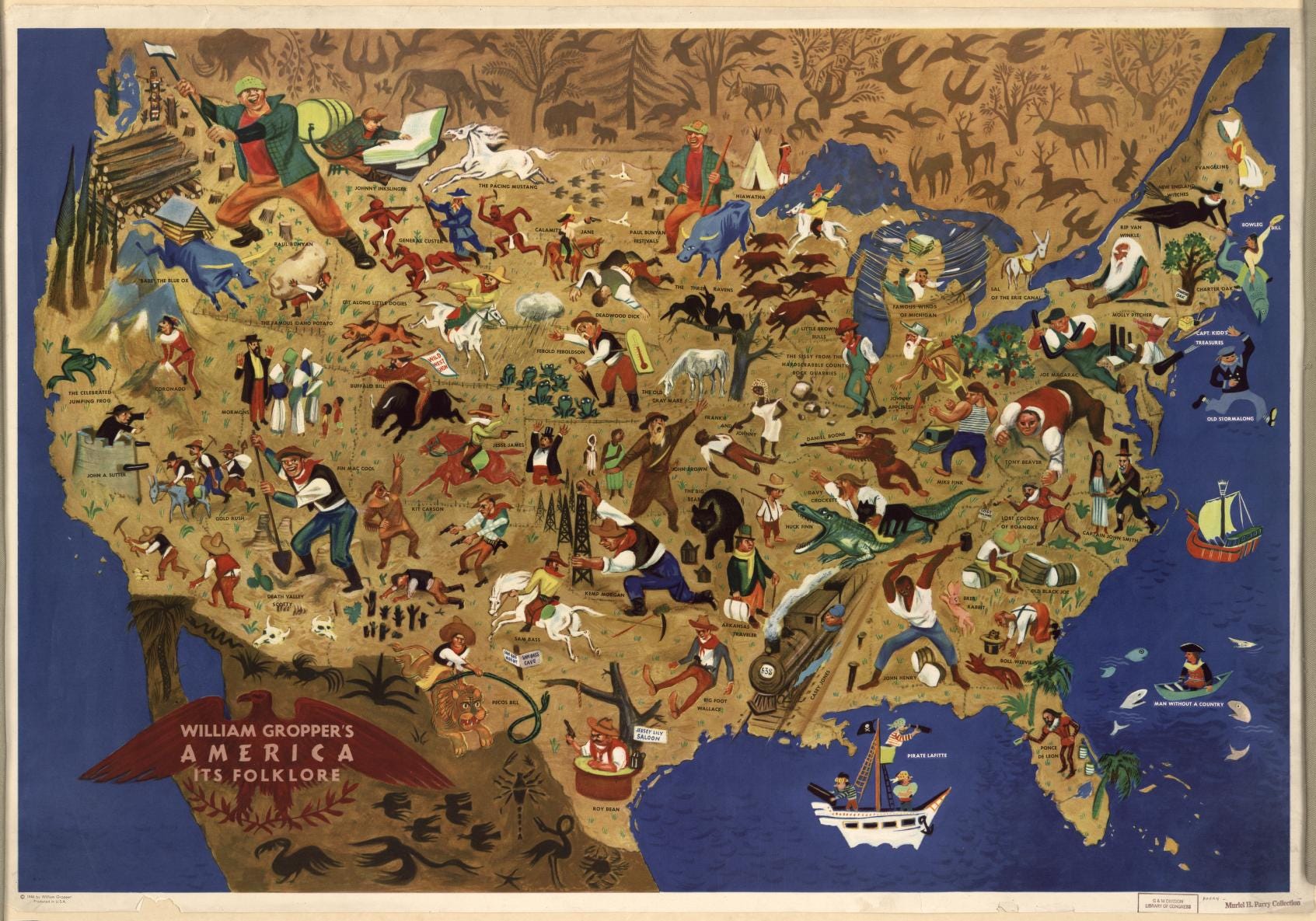
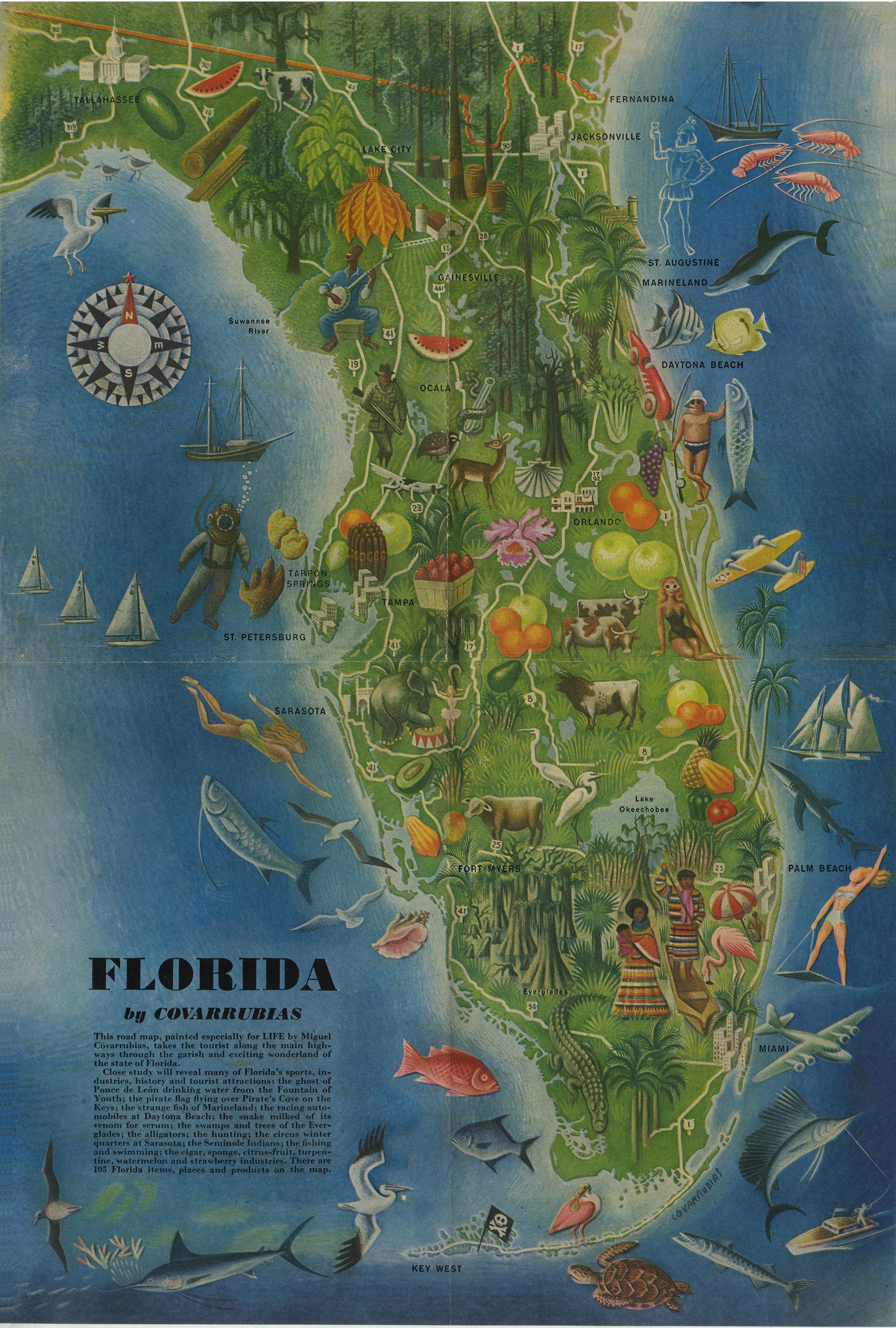
William Gropper’s 1946 map of America’s myths and folklore (seems like folk songs as well in some of the images) is using the U.S. as a backdrop, and has a similar aim as the Greyhound ad. Both gather and cohere the different stories/places across the country to map an America of shared culture and expression, as the Greyhound ad copy intones, “…the underlying charm of the real America.” This makes perfect sense during and just after WW2, as the shared hardship unites the country. Maps can be thick with meaning.
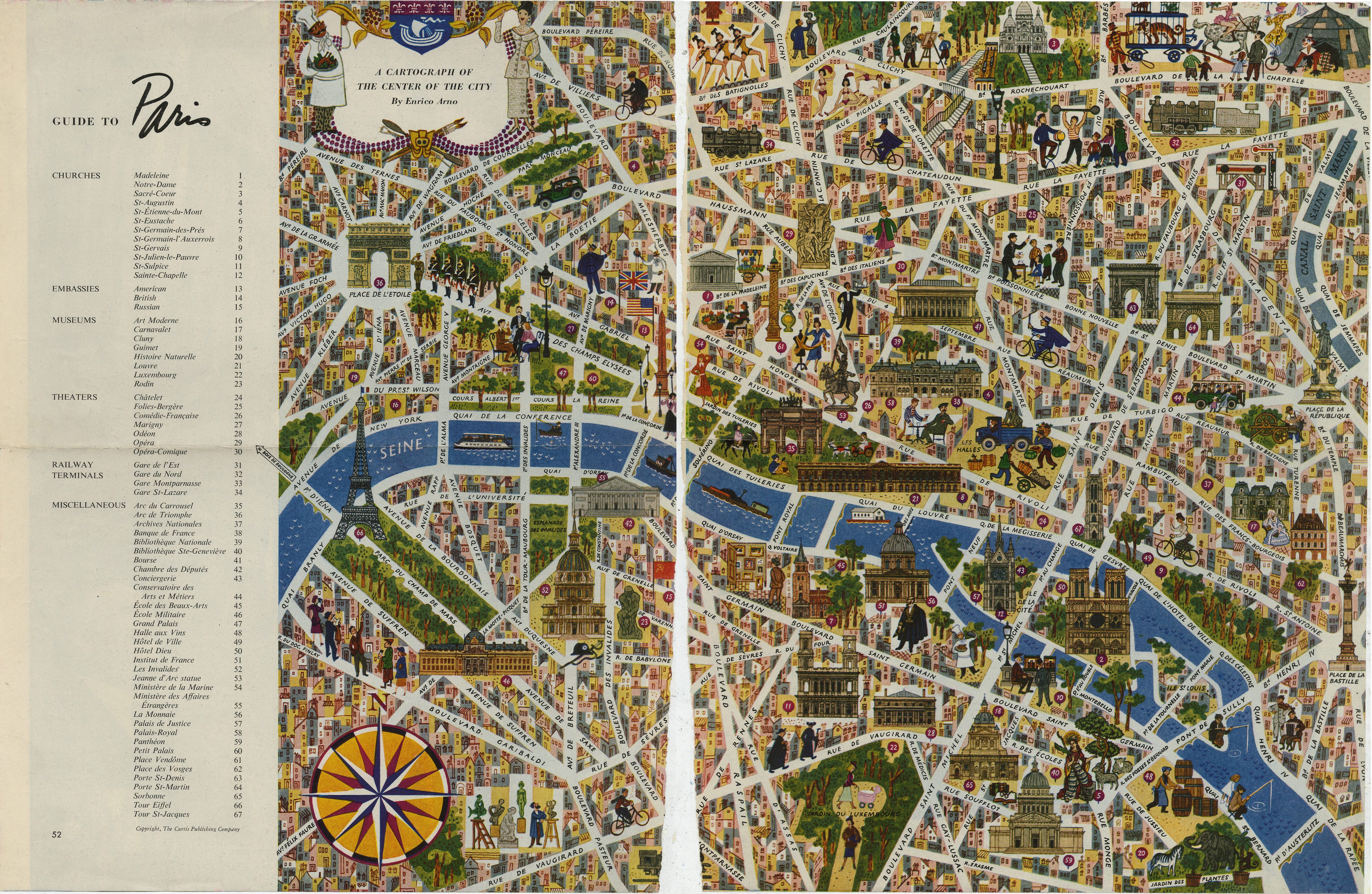
This 1954 map of Paris is a great example of a tourist map, reducing the streets and the rich life of the city down to a checklist that your bus driver can attempt to drive you by in a day. When I lived in Florence I remember seeing the countless tour guides holding their flags with weary travelers trudging behind them snapping a picture and then back on the bus. These posed souvenir photos don’t return us to the streets or the people of our travels, rather they provide a single viewpoint. In drawing, the same problem of looking through one lens, holding onto our comfortable habits, blinds us to the big picture…we are tourists to the drawing process.
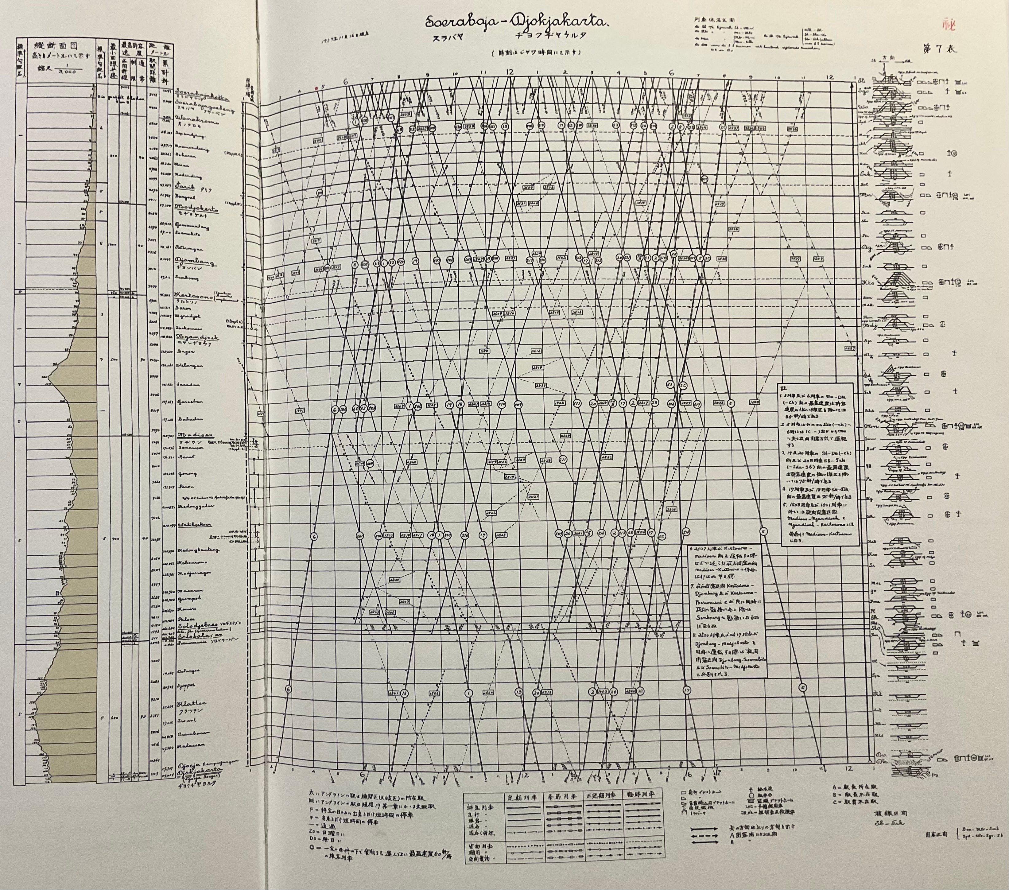
The Java rail schedule is another form of map or use of flatland to express the real world. In this complex of lines and notation, the time, place, direction, and even speed (the steepness of a diagonal) are expressed. The topography and the grade of each journey is also recorded in a legend on the left. This schedule was created in 1937 before user experience design or interaction design were a thing. It feels a bit like a graphic design archaeological dig, like unearthing a complex cultural artifact that we need a key to unlock. The key is reading and close observation to mine the riches contained within the design…is this what we are teaching in art schools? In visual communication programs are we developing experts in visual literacy? Maps need to be read, but even the basic roadmap now sits in the palm of our hands and direction is parceled out turn by turn. We all live in visual passivity.
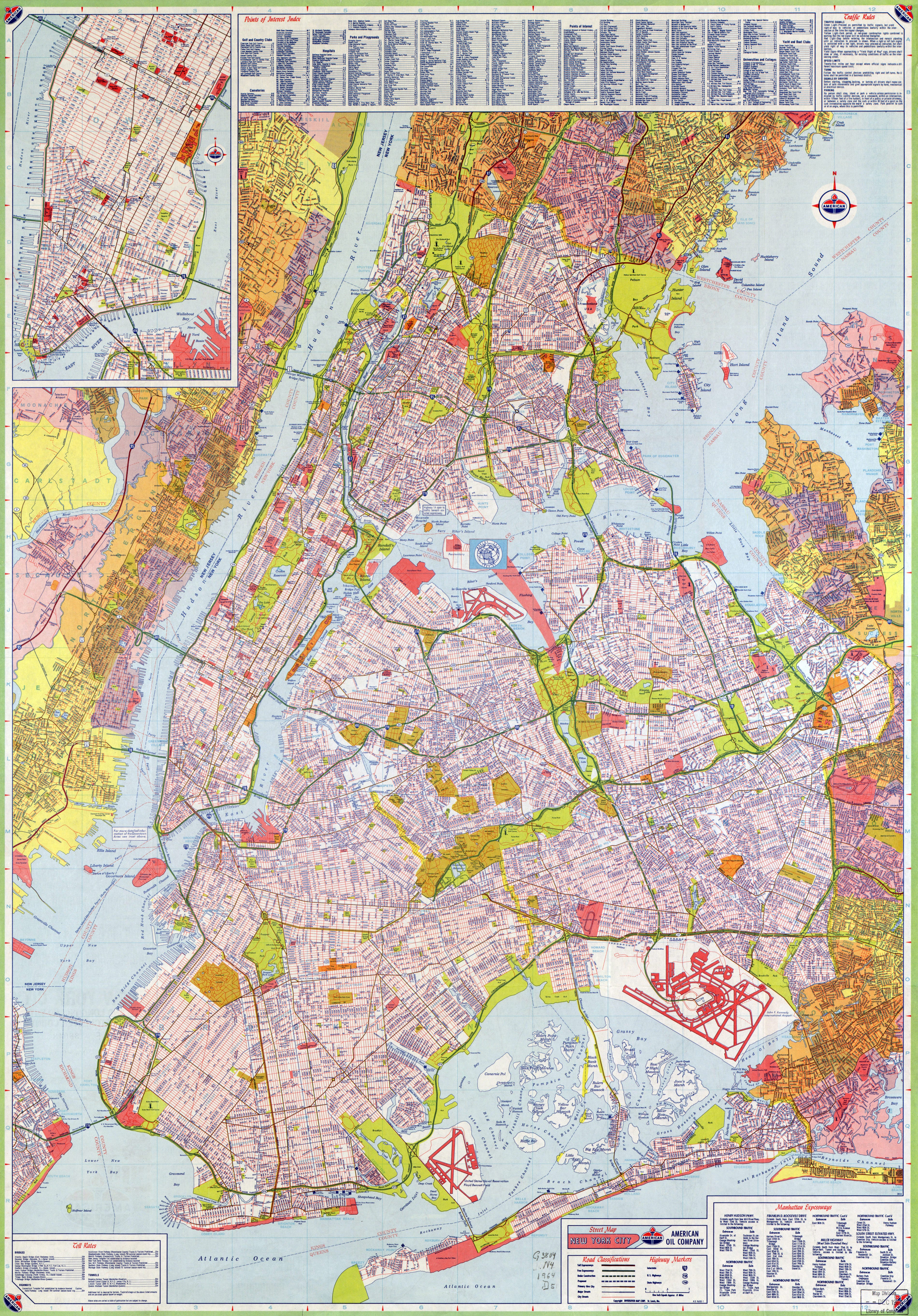
A lack of direction can lead to a lack of meaning and maybe our passive engagement with the visual, is a symptom of that rudderless feeling. Looking at the 1964 NYC map, I can’t believe the density, and this is 60 years ago! My recent drive to Brooklyn relied on the cyclopic Google maps of road stumbling after road, with the arrival time ballooning and shrinking. I’m not throwing my phone away anytime soon for a return to folded paper, but the powerful flatland contained in that 60 year old map and the context it offers needs to be a part of our journey.
So, what about art students and the visual world they live in? The map as an example of 3D complexity interpreted in a 2D language has lost its resonance. Visuals move across the sea of our screens without a ripple on the surface, but to understand space, you need to see through, and in and out. In drawing you can show, you can tell, but that doesn’t always work, especially with complex problems. I also try to use examples outside of drawing and the map is a great way to express multiple things at once. I can use a map to situate myself, to determine which route I want to take, how long it will take, what points of interest are along the way, and these steps need to be read, interpreted and translated into real world decisions.

Drawing is making decisions on a flat piece of paper, informed by the intent of the artist. In the drawing exercise where the purpose is drawing form in space the decisions have to be informed by seeing, interpreting, and making changes that express space and don’t just mirror what is seen. The visual has to be activated, edited, and engaged with and not just passively, slavishly copying the surface of everything, everywhere, all at once. Sounds a lot like a road map. We are never going back to the spidery, circulatory system, of graphic veins and arteries that we used to read as we sped along the highway, but we can excavate these incredible feats of visual language and learn from what they don’t say and hopefully they will help us find our way.