
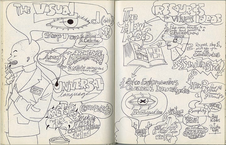


I was late for a meeting and as a Program Coordinator I need to take notes, but as an Illustrator, I write out my notes and use graphic shapes and diagrams to help organize my thoughts in unlined sketchbooks. My meeting sketchbook and all of my drawing sketchbooks stretching back to my first real one at age 18, were the black hardcover and white paper variety. My sketchbook was full and I had to get to this meeting, so I hurried to the school store and grabbed the first sketchbook I could find.


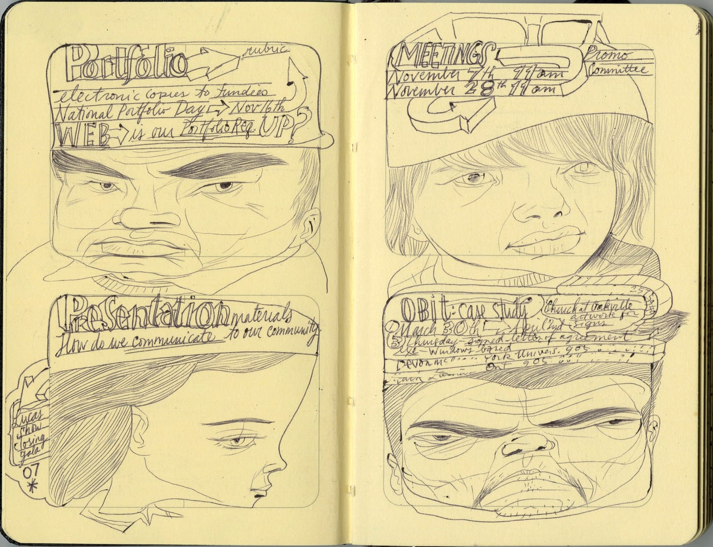
As the meeting began, I opened the book and to my horror I saw that the pages were printed with thin lined rectangles. Half the sketchbook was 2 rectangle boxes per page and the last half was 4 small rectangles per page…a storyboard sketchbook! I love a blank piece of paper, where I can control the space and content and here was a book imposing it’s own sense of order on the page.
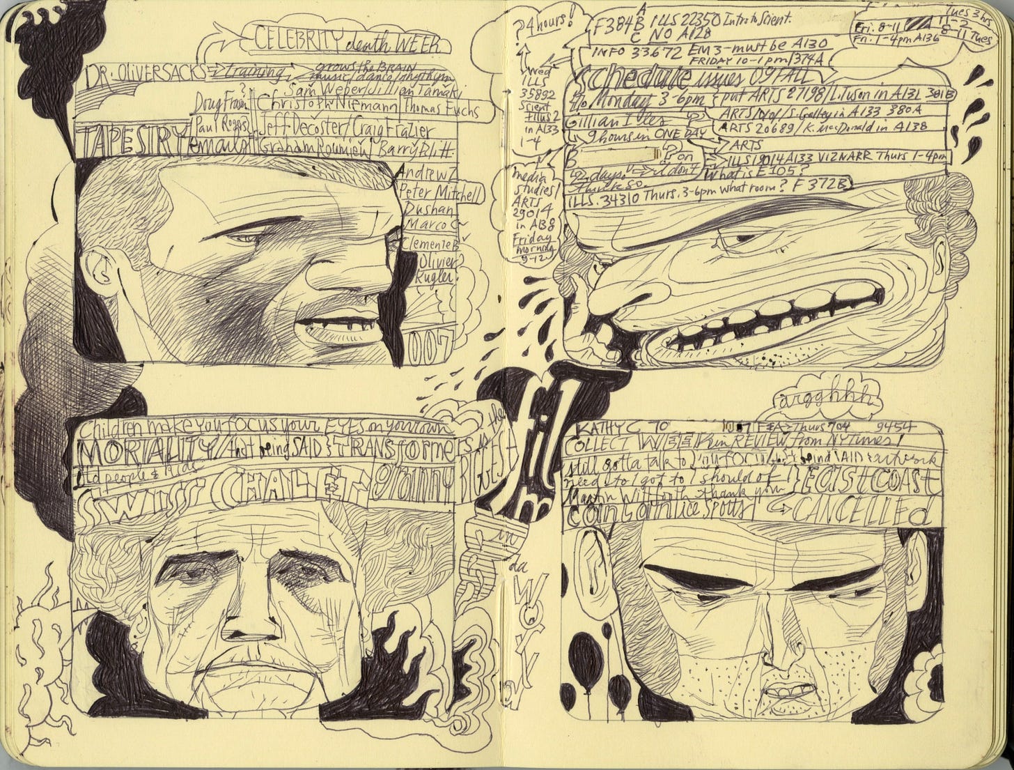
The agenda of the meeting dealt with 4 topics, so I divided each topic into a box and created characters with kind of silly hats of content for each agenda item.
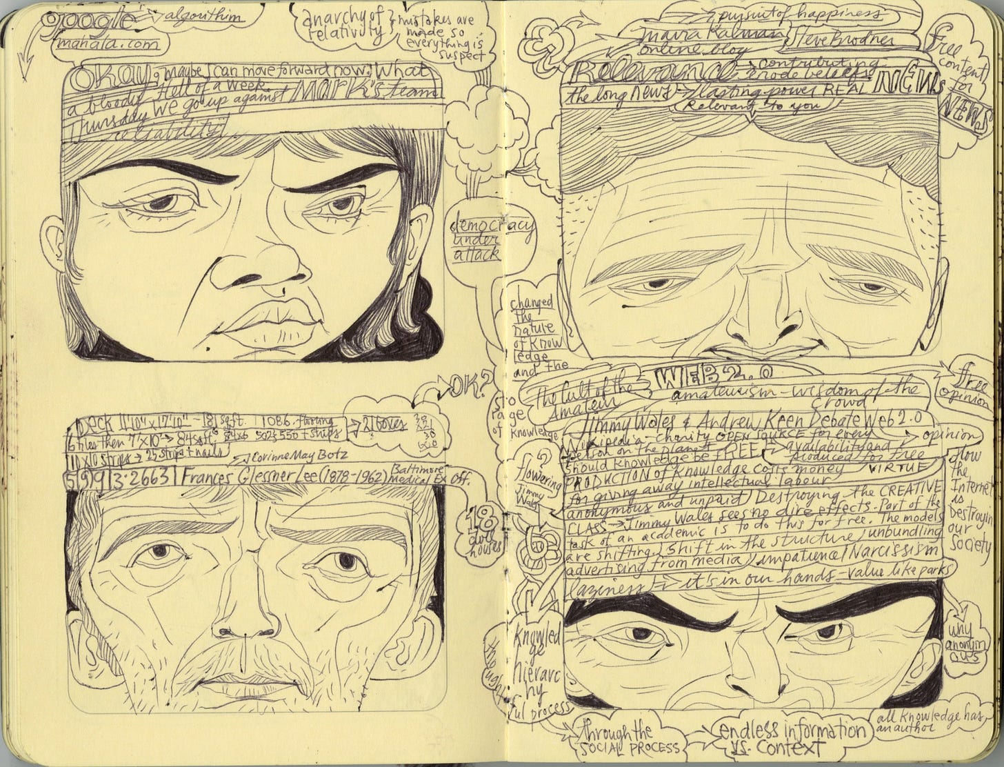
These first awkward notes and faces suspended in these lined boxes on the page showed little promise to me. But I wasn’t about to buy a new journal, I reasoned that I could just either ignore the boxes or work around them. I would focus this book on meeting notes anyways. I mostly just drew inside the boxes like a diligent 5 year old with a colouring book at first. But there were 2 differences using this Moleskine, beyond the panels. I had opted for a smaller size and an unexpected difference, the paper. The thick, smooth, warm hued paper responded to the black ink of the ballpoint pen much differently than the typical toothy white paper of a sketchbook.
The preprinted fine lines of the book created a line scale that I adapted my line and text to respond to. It was like the unconscious matching of your breathing in a close embrace with your partner.
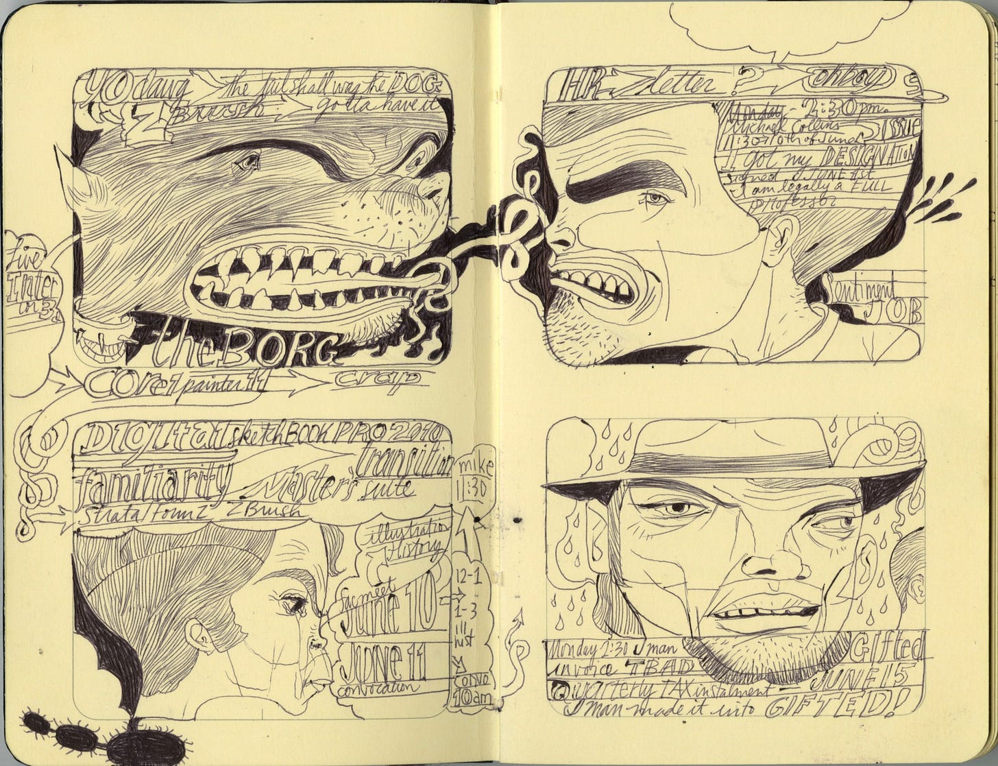
The negative space outlined by the storyboard box was ideal for blacking out to reinforce the shaping of the characters. The black on cream paper seemed more dimensional than black on white. More graphics began to appear.
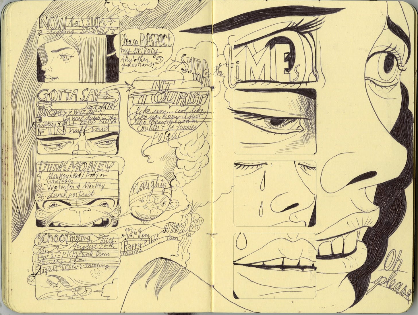
The panels became opportunities to frame and reframe content. The book became an essential part of notetaking and of ideation. For the first time I was actually thinking through drawing, building a visual, tactile and graphic language. I was forced to slow down as each of these spreads became more complex and involved. But this focus helped me to think through imagery, the pages were never planned or sketched out but occurred at the speed of the unspooling event or thought or content that was present.
When the school semester ended the small black book remained in my hands. The increased cognitive load of teaching, parenting, and illustrating was compressed into these framed pages. The order and regularity of the box and my focus on the making of the image provided the gravity for a world dominated by words, strategies, emotions, and passions. A visual world without a coherent visual language.
This sketchbook changed my life. 30 years after I opened my first sketchbook, this mistake of a purchase changed the way I think through images. The visual thinking I developed in the 10 books in this series inform everything I do and the critical concerns I have for our visual future. More on that next week…


Astounding sketches Joe and wonderful story of liberation by constraints. These must be published. Let’s talk.