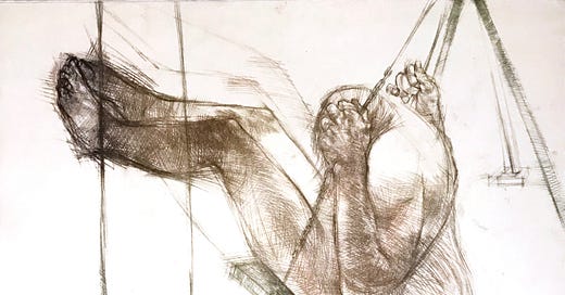
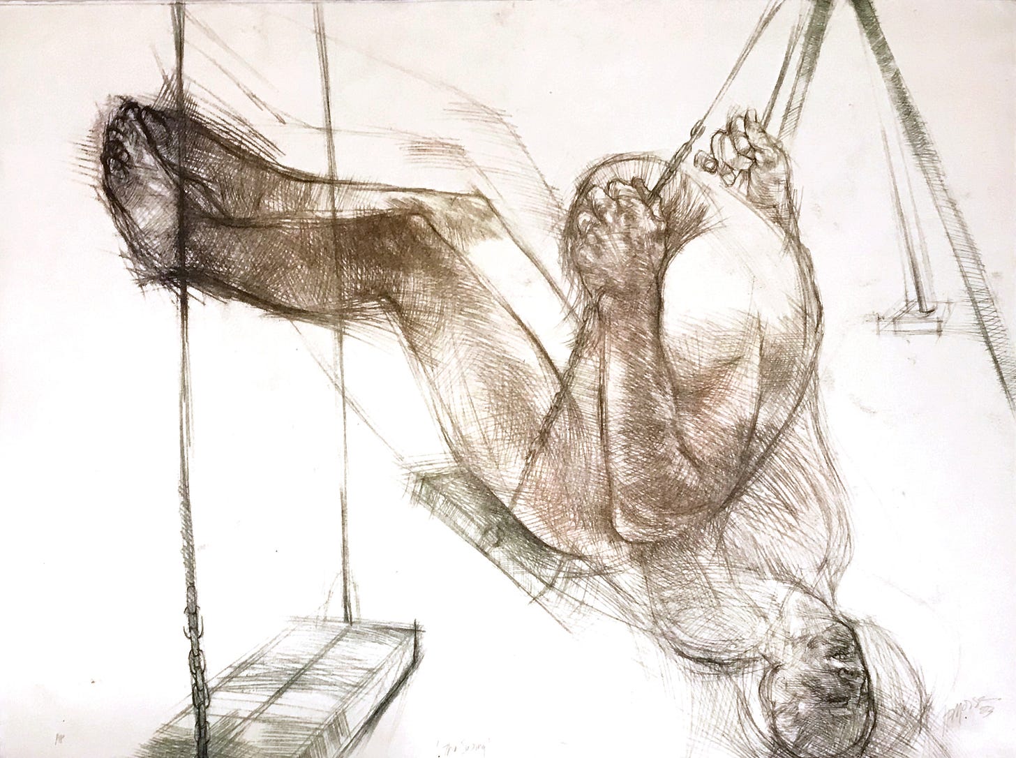
The most meaningful creative experiences in my life have been inspired by materials. As an art student, I took one printmaking course in my 3rd year and in my 4th year negotiated with my Profs to spend most of my time in the printshop. I was not a printmaker or training to be a printmaker, I was using a process that challenged me to push an image in multiple directions. In litho, one of my Profs was incensed by the loss of control in the edition, as ‘scumming’—the loss of line as ink over fills the surface of the plate, was taking over my images. God, I loved scumming…the process obliterating my careful cross hatching.
In litho, you have the consistency of ink, the charging of the roller—-you know the sound when the roller has enough ink, constantly sponging the stone or plate with water so that the areas to receive the grease/ink that repel water will be the only area filled. The paper and its tooth and the pressure of the press all contribute to the incredible reveal of pulling the paper off the plate and seeing the variance of all of these factors in the image. These prints unlike a giclée are not identical, and that is also the point of the medium.
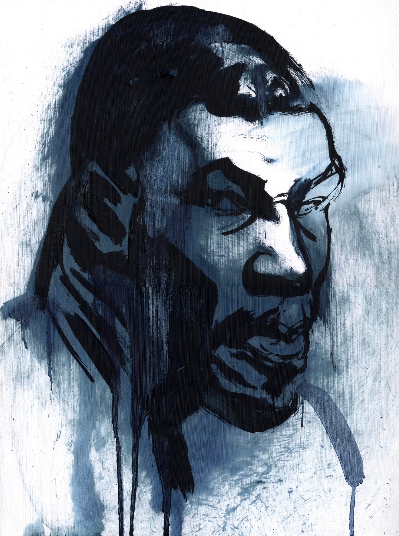
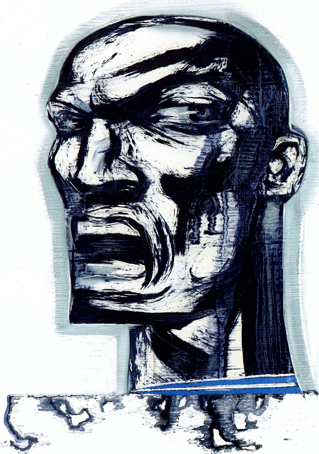
10 years after my first print I began to use solvents and oil pigment and texture again in my paintings. The solvents had a mind of their own, sometimes burning away features and forms. The process was the content, the immediacy collided with the graphic urgency of the subject matter.
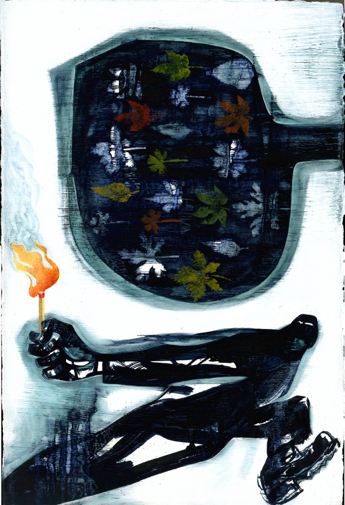
Gravity and direction became content as images were developed with elements creating narrative through juxtaposition. I added acrylic paint graphics and shaped the negative space to implicate the white background as a participant in the image meaning. The use of the edge and the image direction were not gimmicks but questions about visual hierarchy and meaning.
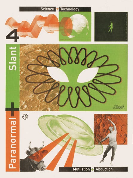
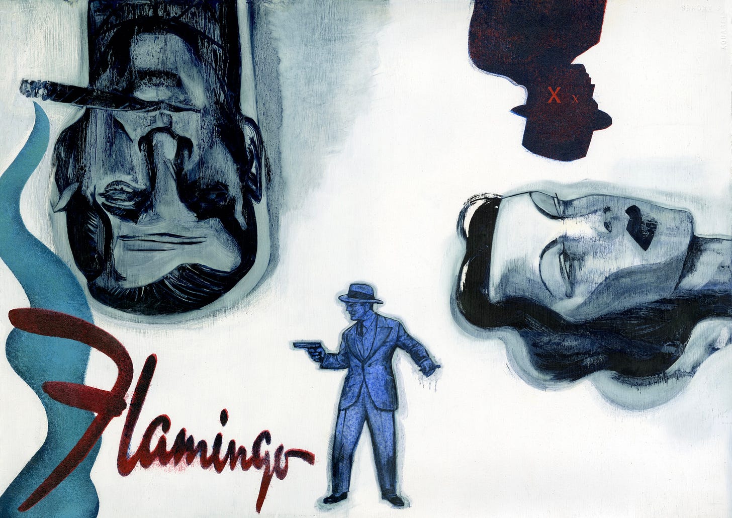
Slant Magazine was a newsprint art and culture magazine published quarterly by Urban Outfitters and distributed in their stores as an alternative to print advertising. It was an incredibly inspiring magazine with great design, Illustration and comics. I was commissioned to do a spread on Bugsy Siegel, the mobster that developed the Las Vegas casino strip.
I did this painting after the commission. I wanted to push the graphic content of a purely visual approach—no text. Typically the main portrait is the focus and my original design had Siegel at the bottom, but the gunman and the Flamingo graphic are attempting to hold the weight of the bottom. Looking at it now maybe increasing the scale of the Flamingo graphic to overlap Siegel and the gunman would have worked better, but the thick stencilled acrylic on this painting means I will live with my original decisions.
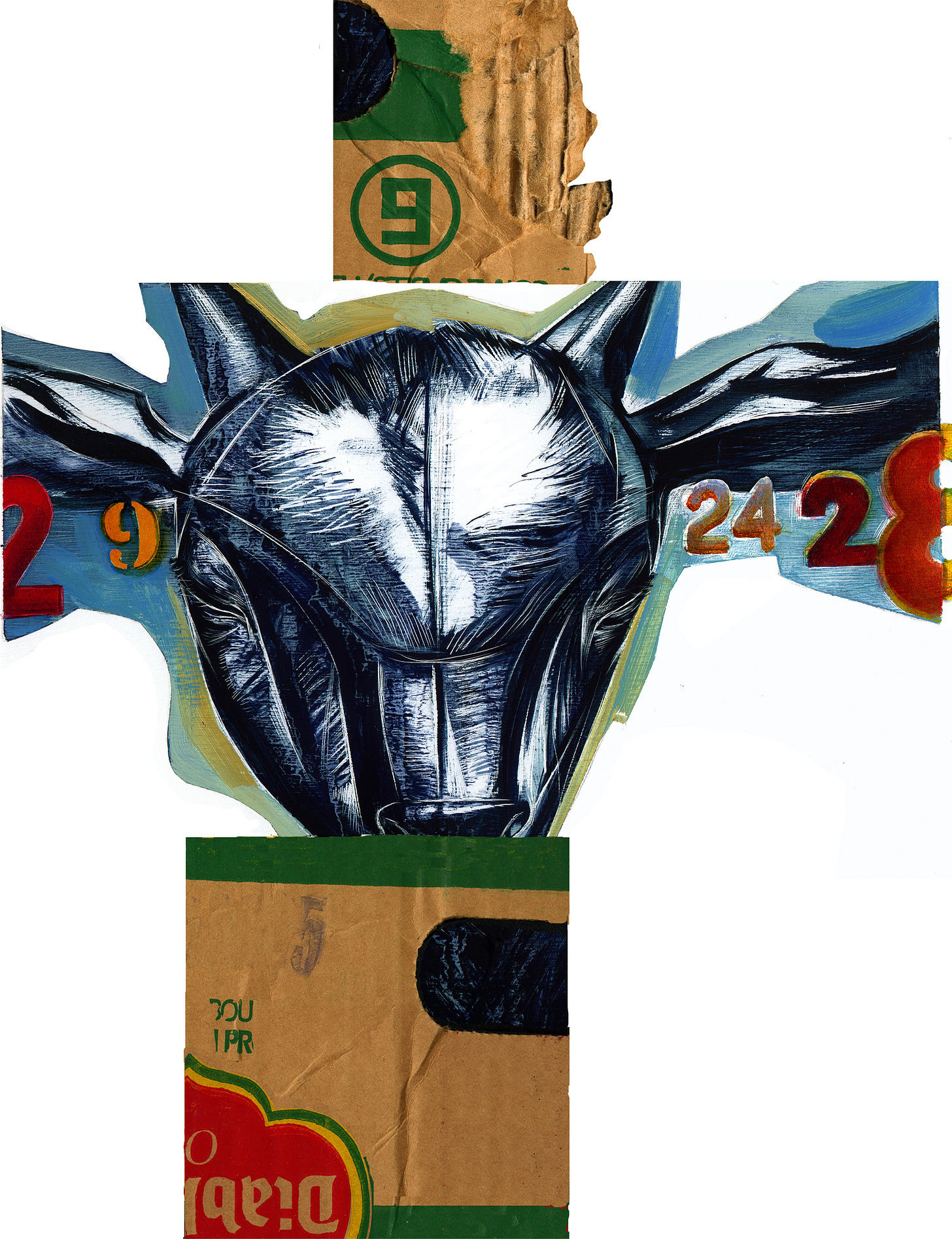
This piece illustrates a disturbing true story about goat remains being left in 9 different locations in Vancouver. The remains are left in cardboard boxes and the dates and spacing of the finds become part of the mystery. Is it some strange ritual or protest? We never find out.
I don’t use collage, I like to draw or paint all elements, but I purposely used scanned cardboard with the brand edited to spell Diablo to provoke an identification with the real thing. The tension between the photographic and the graphic is part of the discomfort of the subject matter.
I can now type images into existence or slide my Apple Pencil over glass to mimic a myriad of material pantomimes——but the ineffable, and intangible will always be out of reach. Will we cease to look for these transformative mistakes or opportunities, like the solvent that snuck under my taped off image border above and seemed to speak with it’s own material language.

